2A re-reading of The Economist's Tracking the Stealthy Killer
3A map that already lied.
4In early March 2020, the world's COVID-19 case map was less a record of where the virus was than a record of where countries were looking. 5Tourism flows showed exactly who was looking the wrong way.
601 · The hook
7A map that already lied
8On 4 March 2020, the Johns Hopkins dashboard counted 95,124 COVID-19 cases worldwide. 9China held 80,271 of them. 10Hubei province by itself held 67,332 — more than 70% of the global total in a single Chinese province. 11Outside China, only three countries had crossed 2,000 cases: South Korea, Italy and Iran.
12Two days later, The Economist published a Graphic Detail piece arguing this map was already wrong. 13Not the China numbers, which dwarfed everything. 14The numbers everywhere else — the apparently quiet places where governments were still saying "we have a few imported cases, things are under control."
15What the piece had was an unusual yardstick: how many Chinese tourists each country had received the previous summer.
3
16Reported COVID-19 cases on 4 March 2020 — top 15 countries
17China held 84% of the global total. 18Outside it, almost nothing.
19Source: Johns Hopkins University CSSE dashboard, 4 Mar 2020. Log scale on x.
420Early March 2020. 21The numbers were small. 22The airports were already emptying.
2302 · The yardstick
24The yardstick: Chinese tour groups
25The Economist's data came from a slightly improbable place. 26China's Ministry of Culture and Tourism tracks tour-group travellers — both directions — for the top 30 destination/origin countries plus continent residuals. 27It was the most recent globally consistent measure of who was moving between China and the rest of the world: Q3 2019, the latest quarter available when the analysis ran.
28The flows are wildly uneven. 29Thailand alone saw 1.55 million Chinese tour-group trips in a single quarter — almost twice Japan's 1.25 million. 30Taiwan, Vietnam, Singapore, Malaysia and Russia each handled between 400,000 and 950,000. 31The top ten destinations accounted for 74% of all flow.
32The intuition was simple. 33If the virus moves with travellers, then the more travellers a country had received, the more cases it should have — controlling, roughly, for how hard each country was looking.
5
34Chinese tour-group flows, Q3 2019 — top 15 destinations
35OECD bars in warm tone, non-OECD muted. 36The largest exposures sit outside the OECD.
37Source: China Ministry of Culture and Tourism, Q3 2019 (mean of inbound and outbound).
3803 · The model
The OECD line
39Fit a single line through the 34 OECD countries and you get a remarkably clean answer. 40log(cases+1) = -8.44 + 1.13 × log(tourism). The slope is highly significant (p < 1e-7) and the model explains 59% of the variance in log-cases across OECD members.
42The choice to fit only the OECD was deliberate. 43OECD countries had broadly similar testing infrastructure in early March 2020 — what they reported was, more or less, what they actually saw. 44Project that line outward to non-OECD countries and you get an "expected" caseload: how many cases each country would45have if its surveillance worked like an OECD country's. 46The residual — distance from the line — becomes a surveillance gap.
6
47The OECD-only fit, drawn through 124 countries
48log(cases+1) = -8.44 + 1.13 × log(tourism). 49R² = 0.59. 50Fit on OECD only; non-OECD shown for context.
51Source: JHU CSSE (cases) + China MoCT (tourism). 52OLS fit over 34 OECD countries.
5304 · The reveal
Below the line
54Plotted on a single chart, the answer is immediate. 55OECD countries cluster around the line. 56Non-OECD countries scatter widely — and a striking number of them sit far below.
57Russia is the most extreme. 58With 434,000 mean Chinese tour-group flows, the model expected 517 cases on 4 March. 59The country reported three. 60Indonesia: 330 expected, two reported. 61Myanmar: 110 expected, zero. 62The Philippines, Vietnam and Thailand each reported between 50 and 70 times fewer cases than the OECD-fit line implies.
63These were not obscure countries with tiny tourism. 64Thailand was the single largest destination of Chinese tour groups in Q3 2019. 65Vietnam and Indonesia were both in the global top ten. 66The places best positioned to import early COVID-19 were the places reporting the fewest cases.
7
Tourism vs. 67reported cases — hover any country to see its residual
68Each dot is one country. 69The line is the OECD-only OLS fit. 70Hover to read country, tourism, reported, predicted, multiplier.
71OECD (n=34)72Non-OECD (n=90)OECD-only fit line
73Tip: outliers are pre-labelled. 74Hover any unlabelled point for details.
75All 124 countries. 76Both axes log; cases axis offset by +1 for log.
7705 · The other end
Above the line
78At the opposite end of the residual list are countries whose case counts are running ahead of their tourism. 79Iran is the most extreme: 2,922 reported cases against a tourism-implied 12. 80Italy reports 3,089 against 156. 81South Korea: 5,621 against 392. 82These are not surveillance failures — they are countries where the virus had already gone domestic, where local transmission had outpaced anything imports alone could explain.
83By this point the model is doing two things at once. 84Below the line: a country where the virus is probably present but invisible to the surveillance system. 85Above the line: a country where the surveillance system is working but the outbreak has accelerated past what tourism alone seeded.
8
8615 countries reporting more cases than tourism alone would predict
87Residual measured in log-units above the OECD-fit line. 88Iran is in a class of its own.
89Positive residuals = above the line = local transmission outpacing imports.
9006 · The asymmetry
91A surveillance gap, by group
92Step back from individual countries and the systematic gap is unmistakable. 93The OECD residuals are mean-zero by construction. 94The 90 non-OECD countries, scored against that same line, average -0.85 log-units below it — equivalent to reporting 43% of what the OECD-pattern would predict. 9564% of non-OECD countries sit below the line, against 56% of OECD members.
96Pour through the residuals and the diagnosis becomes hard to ignore: the early-March case map is shaped less by where the virus is than by who is testing for it.
9
97Distribution of residuals — OECD vs non-OECD
98Two overlapping histograms of every country's distance from the fit line.
99Bin width: 0.5 log-units. 100Vertical lines mark each group's median.
10107 · The multiplier
102What the model says is missing
103Read the model literally and the implied under-counts are vast. 104Russia: 172x. 105Indonesia: 165x. 106Myanmar: 110x. 107Philippines: 69x. 108Vietnam: 54x. 109Thailand: 51x. 110These are not absolute predictions of the truth — but they are estimates of how far the reported numbers are from the tourism-implied baseline.
10
172×Russia 111predicted vs reported
165×Indonesia 112predicted vs reported
110×Myanmar 113predicted vs reported
69×Philippines 114predicted vs reported
54×Vietnam 115predicted vs reported
51×Thailand 116predicted vs reported
117Subsequent peer-reviewed work would land in roughly the same place. 118A Pulmonology paper using case-fatality ratios estimated that Iran's true caseload was about 34 times its reported total in mid-March, Italy's 73 times, Spain's 161 times. 119A Science paper estimated 86% of pre-23-January infections in China had gone undocumented. 120The tourism model, fit on a single morning's data, was pointing in the same direction these much-more-elaborate methods would later confirm.
121In Indonesia, community transmission would not be officially acknowledged until late March. 122Iran's hospitals were already overwhelmed when its case count was being reported in the hundreds. 123The Economist's piece, days before either of those facts became visible, said: look at the residuals.
11
124Implied under-detection multipliers — top 12
125Predicted ÷ reported, log scale. 126Read as "the model implies this country was reporting one in N of its tourism-baseline cases."
127Compare to subsequent peer-reviewed estimates: Iran 34×, Italy 73×, Spain 161× (Lau et al. 1282020, Pulmonology).
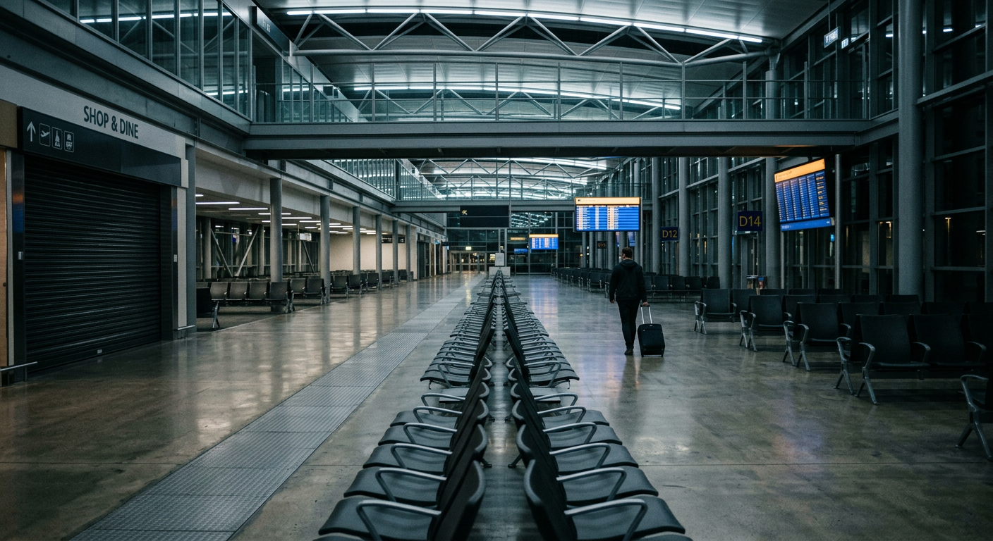
des_ref_01129Late February / early March 2020. 130While Russia, Indonesia and the Philippines were still reporting handfuls of cases, streets like this were emptying out city by city. 131Editorial illustration.
13208 · The close
Reading the gaps
133What was new about the piece was not the regression. It was the framing. 134Most early-March 2020 reporting treated case counts as a thermometer: a higher number meant a worse outbreak. 135The Economist's argument was that the thermometer itself was uneven — some countries were holding it under their tongue and others were leaving it in their pocket — and that tourism flows could tell you which was which.
136Read forwards, the residuals were a bet on what would happen next. 137The countries furthest below the line, the model implied, were the countries whose first wave was still hidden. 138Most of them would be in the news within weeks.
139When you cannot measure a thing directly, find a proxy for what should be there140, fit it on the part of the world that measures well, and read the gap.
141The lasting lesson is not the specific multipliers — those are noisy, single-quarter, single-day estimates. 142It is the move itself: when you cannot measure a thing directly, find a proxy for what should143be there, fit it on the part of the world that measures well, and read the gap.
Caveats.144Tour-group flows are a proxy: not all travellers move in groups, and the data are six months old. 145The OECD-only fit projects an "expected" caseload onto countries with very different surveillance, healthcare and demographics — a residual is not proof of under-reporting. 146All confirmed-case figures are reported numbers, themselves subject to lag and reporting practice on 4 March 2020.